rjn.design
CLOSE

Time: 4 Weeks (December 2019)
Program: COGS 187A: Usability and Info. Architecture @ UC San Diego
Deliverables: high fidelity prototype and team case study
Team: Jamin Capulong, Johnrey Pahed, Ronald Montehermoso
My role: UX researcher and UX/UI designer
Pandora is a music platform that creates radio stations based on artists, songs, and albums.
My team was challenged to redesign Pandora's interface to promote playlists. Studies reveal that people like using playlists because they have more control on what they listen to. The problem is that people were not aware of this feature.
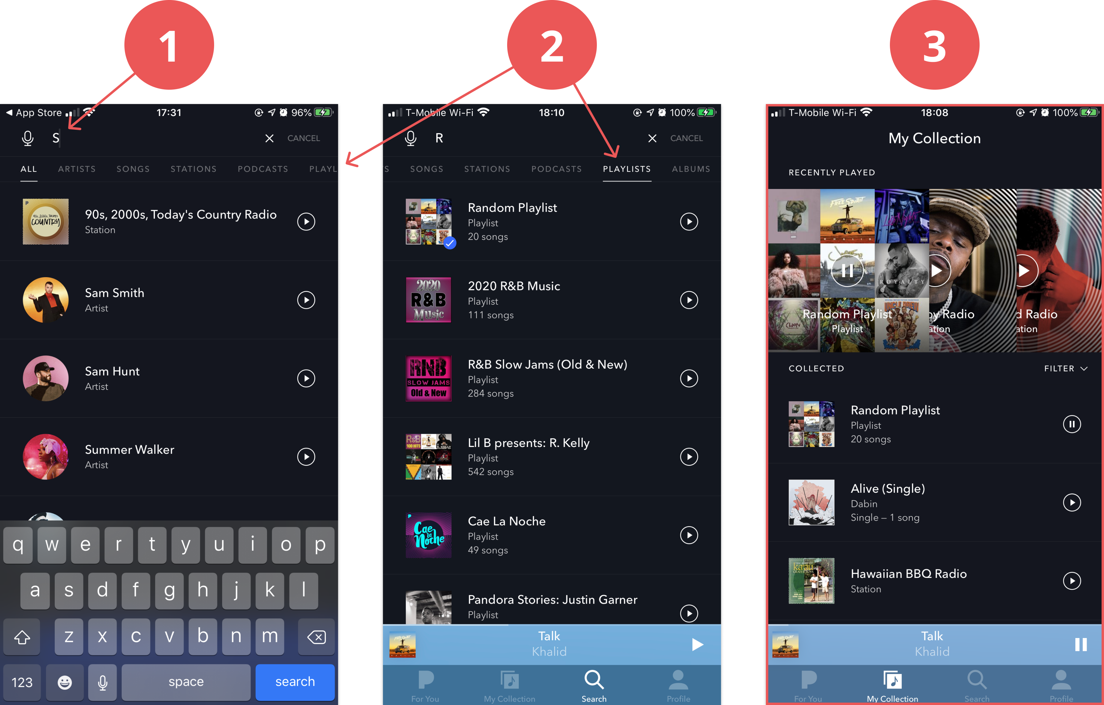
1) Enter the search page and type something.
2) Choose the "PLAYLIST" category at the top right (it's cut off).
3) Tap on a playlist and be transported to a new My Collection page.
We gained more insights through interviews and user testing pandora's original design. Each team member conducted an interview and user testing plan for 1 person (4 interviewees total). All participants were college students between the ages of 19-21.
All of our users had difficulty locating playlists in Pandora. They couldn't complete the task without us walking them through the process. They expressed frustrations about how indistinguishable playlists and stations are, when the feature wasn't where they expected, and that they weren't aware of the playlist feature.

"I couldn't tell the difference between playlists and radio stations. The only thing that tells them apart is the tiny caption underneath the title."
"I found the playlists in my profile, but shouldn't it be in the my collection part?"
"There's a playlist option? I thought Pandora was only radio."
We aggregated our findings into 1 persona to help us decide who we are designing for. Travis represents our users' backgrounds, needs, and frustrations. We kept Travis in mind throughout the process.

The playlists are taken out of the hidden My Collection screen into its own designated space. This design puts playlists and stations in the same hierarchy, therefore promoting it to be another one of Pandora's main features. Users can now access a page dedicated to one type of content through 1 tap instead of 4.
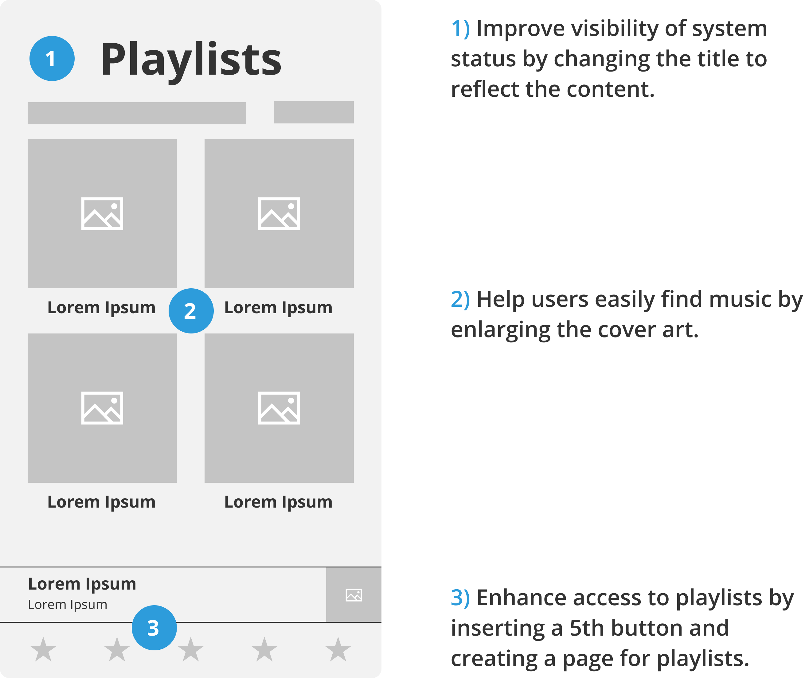
Users are able to clearly view the distinct categories in My Collection. This version also reduces the taps to playlists to 2. The bolded and underline subheading lets users know what list they are viewing.

I thought about our persona and how he needs to find specific content by skimming the phone. Enlarged visuals helps the user easily view the content. It would be more difficult to skim through the condensed list view in solution 2. Solution 1 also allows users to access stations or playlists in one tap from the other pages.
Choosing solution 1 meant that i had to design two new pages to host stations and playlists. I chose the same format for both pages because it keeps the navigation consistent for the user and saves time designing. This decision prompted me to highlight the differences in other ways.
Giving playlists and stations their own buttons created separations of concerns. Users like Travis don't have to sort through 1 page for 2 items. Instead, there is one page dedicated to their respective content. This navigation saves usability time because Travis can access either screen by 1 tap.

Stations, playlists, and artists are distinguished by shape and look. Stations are square with a white circular overlay that represent waves. Playlists will have art without that pattern. Circles are solely used for artists because circles are more friendly. This let's users know what category the item belongs to without reading a description.

1) Titles inform users.
2) Cover art have differing styles
3) Clear communication of what button is selected.


Check out the prototype by clicking here.
I would've tested the new design to gain feedback for another iteration. I also want to address how the music is displayed within the playlists.
I learned how to go through the entire design process with teammates. This was my first project in which I worked in every step rather than learning about it. On the technical side, I learned how to rapidly create components and integrate overlays in Figma.
I enjoyed working with other talented designers because we taught each other our strengths in user research and design. I give thanks to jamin, johnrey and matthew (ronald) for being a cool team.